This blog is moving. Please update your bookmark to reflect the home of my new blog: http://erinafrost.wordpress.com.
At least for now, VizRet's past entries will remain at this address. The new blog will include all past entries as well.
Thanks for following!
Wednesday, March 10, 2010

Sunday, February 7, 2010
Buying American is not as simple as it seems

 Do you know what these symbols are?
Well, they're a lot of things.
They're clever marketing. Specifically, they're branding. They're the result of intensive study on what colors and shapes motivate people to buy. They're a source of identity for a whole lot of people. But, all too often these days, they represent a case of mistaken identity.
To be clear, the graphic on the left is Toyota's logo and the graphic on the right is Pontiac's. Two different companies, right? Even companies from two different countries. Anyone who has heard and supported the phrase "Buy American" (which is probably the vast majority of Americans, or at least most of those with disposable income) knows which of these logos you're supposed to gravitate toward when purchasing a new vehicle.
Now let's break that down a little.
These companies are keeping their logos because the visibility of the logos is important to the branding of the vehicles they create. But those companies are not so very different, and the fact that the Pontiac Vibe and the Toyota Corolla have these different logos on them is somewhat misleading. It's not because Toyota and Pontiac are up to anything sinister. It's just an example of how, sometimes, visible rhetoric can keep us from the truth.
Last week, a massive recall was issued on eight kinds of vehicles produced at a California plant. The accelerators stick on these particular eight models, and, well, you can imagine the sorts of disasters that could cause. Among the models recalled were the Vibe and Corolla, as well as six other Toyota vehicles. That's right. They were all produced at the same plant. A plant on U.S. soil, employing American workers and paying American taxes. (And, so far as I know, the other seven vehicles are still in production while the Vibe--along with Pontiac--is now defunct.)
This complicates the notion of buying American. What does it mean, exactly, to buy American? Did I do my country any good when I purchased a Vibe instead of a Corolla? Or was the visibility of my American logo all "Americanness" that my purchase got me?
It will be interesting to see what happens with branding and logos in the automotive industry as we rebound from the recession. I'm not prepared to make any predictions except for one: There will still be a sense of nationality tied up in company brands that actually has very little footing in reality.
Sunday, January 31, 2010
Cyborg vs. Coenen
This is a sort of update to my Aug. 16 entry about the fight between Cris Cyborg Santos and Gina Carano. I noted in that post that the camera work done on the fight was different than the camera work done when male fighters face off. But, it wasn't different in the way one might expect. The cameras framed the women's faces tightly, de-emphasizing their bodies. I wasn't sure whether this was out of some sort of respect for the women, or if it was a heteronormative move aimed to shift the gaze away from female bodies that don't adhere to the norm. I was leaning toward giving Strikeforce the benefit of the doubt. (For the record, it turns out that the Cyborg-Carano fight was the first time a major sponsor featured women fighters in a main event, which could also have contributed to the unusual filming.)
Last night, Cyborg defeated Dutch fighter Marloes Coenen at a Strikeforce event in Miami. And guess what? The camera work was different.
That is, it was different than last time. However, even when I was looking for it, I couldn't see any differences in the way the Cyborg-Coenen fight was filmed and the ways the male-male fights of last night were filmed. The same sort of pre-fight footage was used. The same sort of zooms and focuses were in play. And the post-fight interview was similar to those involving male fighters.
All of which leads me to wonder: How is it that a sport that so many people consider "barbaric" is the one with the most advanced brand of feminism going on?
Interesting, no?
Last night, Cyborg defeated Dutch fighter Marloes Coenen at a Strikeforce event in Miami. And guess what? The camera work was different.
That is, it was different than last time. However, even when I was looking for it, I couldn't see any differences in the way the Cyborg-Coenen fight was filmed and the ways the male-male fights of last night were filmed. The same sort of pre-fight footage was used. The same sort of zooms and focuses were in play. And the post-fight interview was similar to those involving male fighters.
All of which leads me to wonder: How is it that a sport that so many people consider "barbaric" is the one with the most advanced brand of feminism going on?
Interesting, no?
Tuesday, November 10, 2009
A Rant on the Visible Rhetoric of the Comma
This post is just what the title says: a rant. It was really bound to happen at this point in the semester as everything is coming due at once and students begin to realize how much they have left to accomplish with just 2.5 weeks left. I'm in that position myself, so I feel a little bad about my rant ... but not bad enough to call if off.
Imagine sitting down to grade a paper. In your first sweeping glance from top to bottom of the page, you realize you can trace rivers of white space vertically down the paper because of the excessive punctuation usage. On further inspection, you see these rivers are created almost exclusively by commas. And you further realize that most of them are unnecessary.
Gag.
Why can't students use commas?
Actually, I don't really blame them for not understanding commas. Commas are confusing. And everyone uses them incorrectly sometimes. My beef is that my students don't think commas can be understood. I give them a cheat sheet for comma use. I provide them with resources to figure out commas. I offer to talk to them individually about papers with comma problems. But they persist in just sprinkling commas about the page wherever they think they'll look pretty. Ugh!
My point is this: Even punctuation has visible consequences. When I look at that first page described above, the message I get from that writer through the visibility of that page is: I don't know how to use a comma and I don't care enough about this paper to get help.
That's why the visibility of even something as trivial as punctuation is important.
End rant.
Imagine sitting down to grade a paper. In your first sweeping glance from top to bottom of the page, you realize you can trace rivers of white space vertically down the paper because of the excessive punctuation usage. On further inspection, you see these rivers are created almost exclusively by commas. And you further realize that most of them are unnecessary.
Gag.
Why can't students use commas?
Actually, I don't really blame them for not understanding commas. Commas are confusing. And everyone uses them incorrectly sometimes. My beef is that my students don't think commas can be understood. I give them a cheat sheet for comma use. I provide them with resources to figure out commas. I offer to talk to them individually about papers with comma problems. But they persist in just sprinkling commas about the page wherever they think they'll look pretty. Ugh!
My point is this: Even punctuation has visible consequences. When I look at that first page described above, the message I get from that writer through the visibility of that page is: I don't know how to use a comma and I don't care enough about this paper to get help.
That's why the visibility of even something as trivial as punctuation is important.
End rant.
Monday, October 12, 2009
Black Barbie

This ought to cause a stir. Mattel has announced it will release "a new line of African-American Barbie dolls, with fuller lips, a wider nose, and curlier hair."
Although, as a visual rhetorician, mention of Barbie usually gets my back up, I have to say I'm kinda impressed with this turn of events, even if it is far overdue. And, the doll was designed not only by a black woman, but by a mother who presumably has some understanding of Barbie's effect on children.
One troubling feature of the news release, though, is that the new Barbie is dubbed "African-American" in a CNN iReport. I'm not sure of how others conceptualize the difference between being black, being Black, and being African-American, but I do think there is a difference. As an Irish-American, I'd want an Irish-American Barbie to have something more than red hair to demonstrate her ethnicity.
Any thoughts out there?
***
By the way, here is the first comment in the CNN iReport. I thought it was pretty interesting, so I've copied it here verbatim.
"I notice that the designer has stright hair. I don't know if that's her nature style, or if she has it straightened.
Best of both worlds would be for Mattel needs to provide two models - one straight, one kinky. Although they may need to do a market study for which one sells more so they can tailor their production proportionally.
And I'd be tempted to make her butt bigger. But then Barbie really doesn't have that much connection to reality, does she?"
Saturday, September 12, 2009
Bubbles and rebellion
I took one of my classes on a little field trip to a fountain on campus here at Illinois State University this week and asked them to look around and see what they saw in terms of visible rhetoric. They came up with lots of examples, one of which was that the fountain was a visible marker of tranquility.
The fountain is also a sign of affluence, of course, because it demonstrates with significant bulk that the university values art/luxury and has the money and space to show off said art. All said and done, the fountain is definitely a visible sign denoting something about ISU; it's a site of institutionalization.
Two days later, I showed up for class and saw that the fountain looked like this.

Someone had poured soap into it, thus turning a site of institutional power into a site of rebellion. I thought that was a pretty powerful testament to visible rhetoric--plus I think it's darn funny.
(The maintenance workers also laughed about it. Their general response was, "Oh, the fountain needed cleaning anyway." They had it cleaned up in short order, although I think they left it for people to see for as long as they could. My point is, no harm no foul.)
The fountain is also a sign of affluence, of course, because it demonstrates with significant bulk that the university values art/luxury and has the money and space to show off said art. All said and done, the fountain is definitely a visible sign denoting something about ISU; it's a site of institutionalization.
Two days later, I showed up for class and saw that the fountain looked like this.

Someone had poured soap into it, thus turning a site of institutional power into a site of rebellion. I thought that was a pretty powerful testament to visible rhetoric--plus I think it's darn funny.
(The maintenance workers also laughed about it. Their general response was, "Oh, the fountain needed cleaning anyway." They had it cleaned up in short order, although I think they left it for people to see for as long as they could. My point is, no harm no foul.)
Monday, September 7, 2009
In defense of visible rhetoric
I recently ran into a college professor--someone I very much respect--who was of the opinion that rhetoric does not include the visible. I suppose it all depends on how you define certain key terms, one of them being rhetoric. I adhere to the classical definition; rhetoric is the art of persuasion. I would also go so far as to say that what I study (and what this blog explores) is the rhetorical nature of various texts, with "texts" loosely defined, perhaps, as anything with an author. (I think that definition of texts to be a little more problematic, but I'll work on it.) This would include visible artifacts. I'll use just such an artifact as an example, because I think visible rhetoric is the best tool for the defense of visible rhetoric.
So, try to convince me (heck, try to convince yourself!) that this image is not rhetorical.

This image, found on the anti-abortion site stopthealcu.com, is certainly one of the least gruesome examples of visible rhetoric directed at the elimination of abortion. If you have the stomach for it, do an image search for abortion. Talk about some serious persuasion! If you don't think the results you get are rhetorical, then I'm not sure anything will convince you that visible rhetoric is a discipline in its own right ... and a powerful one, at that.
So, try to convince me (heck, try to convince yourself!) that this image is not rhetorical.

This image, found on the anti-abortion site stopthealcu.com, is certainly one of the least gruesome examples of visible rhetoric directed at the elimination of abortion. If you have the stomach for it, do an image search for abortion. Talk about some serious persuasion! If you don't think the results you get are rhetorical, then I'm not sure anything will convince you that visible rhetoric is a discipline in its own right ... and a powerful one, at that.
Tuesday, August 25, 2009
Presidents and Chimps
I've enrolled in a course called "Race, Rhetoric and Technology" this semester, and our very first course reading really got me thinking. (A good sign!) It was an article on race in America by Victor Villanueva. Although I certainly didn't agree with everything in the article (especially the notion of "reverse discrimination," which is a discriminatory term in itself), there were several good points to be had. Two of the narrative examples which stood out to me were:
While the reactions to these two situations were typical -- very little reaction to the Latino children, university-wide outrage at the white student -- the rhetorical tension between the two situations reminded me of the much-debated New York Post monkey cartoon.

This cartoon sparked outrage because many felt it portrayed President Barack Obama, our nation's first "black" president, as a monkey -- which, if true, would obviously be an unethical and outrageous racist commentary. The cartoon's defenders said it did nothing of the sort, rather, it portrayed our political system as the violent chimpanzee that had been gunned down that same week in Stamford, Conn.
Regardless of the cartoonist's true intentions, the fact that there was significant outrage over this cartoon and not a bit of hype over the myriad comparisons between former President George Bush and chimpanzees indicates that race/color is still a visible characteristic that sparks a ridiculous amount of tension in our society. (Regardless of whether "race" is even real or just a social construction -- see my recent post on my culture, rhetoric, and technology blog.)
We still have a lot of work to do here in America.
- The story of two young Latino children found covered in flour, saying they wanted to be white enough to go to school.
- The example of a graduate student who appeared at a Halloween party in blackface, saying he was portraying black jazz musicians, who he admired.
While the reactions to these two situations were typical -- very little reaction to the Latino children, university-wide outrage at the white student -- the rhetorical tension between the two situations reminded me of the much-debated New York Post monkey cartoon.

This cartoon sparked outrage because many felt it portrayed President Barack Obama, our nation's first "black" president, as a monkey -- which, if true, would obviously be an unethical and outrageous racist commentary. The cartoon's defenders said it did nothing of the sort, rather, it portrayed our political system as the violent chimpanzee that had been gunned down that same week in Stamford, Conn.
Regardless of the cartoonist's true intentions, the fact that there was significant outrage over this cartoon and not a bit of hype over the myriad comparisons between former President George Bush and chimpanzees indicates that race/color is still a visible characteristic that sparks a ridiculous amount of tension in our society. (Regardless of whether "race" is even real or just a social construction -- see my recent post on my culture, rhetoric, and technology blog.)
We still have a lot of work to do here in America.
Saturday, August 22, 2009
LASIK ads
I've had a rather hard time finding LASIK ads from countries other than the U.S. Similarly, LASIK photos of people with brown eyes (or any color other than blue) are few and far between.
I did find an article in a Singapore-based zine called "asianone health" about government concerns with the marketing of the LASIK procedure. This article has a companion photo of a person apparently having an eye pressure test done in preparation for LASIK, and the person has brown eyes.

Of course, the fact that the article comes out of Indonesia is not necessarily the determining factor in why a person with brown eyes was chosen for this photo. As you can see, the photo has also been altered to include a scary black box with a caption demanding that people "see the truth about LASIK," with some of the type in a blurry typeface to visibly demonstrate possible complications or problems with the procedure. I also think it's interesting that the person chosen for the photo has almost no visible eyelashes, which is a visual cue connoting sickness. (However, please note that the article is written in standard journalistic style -- the style that most people believe is neutral. I'm just hypothesizing a bias in the photo used, which the author likely had no control over.)
I wondered, at first, why the woman in the photo had no eye makeup on, as the pre-operative procedures don't require a ban on eye makeup. Then I realized I was assuming the model was a woman and that most Indonesian women wear makeup. More on those cultural assumptions later.
I did find an article in a Singapore-based zine called "asianone health" about government concerns with the marketing of the LASIK procedure. This article has a companion photo of a person apparently having an eye pressure test done in preparation for LASIK, and the person has brown eyes.

Of course, the fact that the article comes out of Indonesia is not necessarily the determining factor in why a person with brown eyes was chosen for this photo. As you can see, the photo has also been altered to include a scary black box with a caption demanding that people "see the truth about LASIK," with some of the type in a blurry typeface to visibly demonstrate possible complications or problems with the procedure. I also think it's interesting that the person chosen for the photo has almost no visible eyelashes, which is a visual cue connoting sickness. (However, please note that the article is written in standard journalistic style -- the style that most people believe is neutral. I'm just hypothesizing a bias in the photo used, which the author likely had no control over.)
I wondered, at first, why the woman in the photo had no eye makeup on, as the pre-operative procedures don't require a ban on eye makeup. Then I realized I was assuming the model was a woman and that most Indonesian women wear makeup. More on those cultural assumptions later.
Sunday, August 16, 2009
Cyborg vs. Carano

Here's something I don't think I've touched on before: fighting. Talk about some visible rhetoric! Mixed martial arts is an up-and-coming sport, largely because the amount of blood inherent in the fights kept it off TV for a number of years.
I was at a friend's house this weekend to watch the fight between Cris Cyborg and Gina Carano. It was the first time I'd watched a major fight between women. However, I'd seen enough of "The Ultimate Fighter" and other UFC fights to notice a distinct change in the visible rhetoric of the broadcast.
The first thing I noticed was that there was a lot more emphasis on the women's faces. As the two prepared to face off, cameras maintained a tight focus on each of their faces. In fact, the focus became so tight that it eventually narrowed to just the eyes. I've never seen this done with male fighters while they are actually in the ring. This was pretty interesting given that women usually have their bodies played up in Western-style broadcasts. So, is this a sign of a feminist attitude within the fighting culture, or is it some sort of strange twisting of that usual prejudice? I'm leaning toward the former, especially since it was clear that the observers of the fight -- including many well known male fighters -- thought of it as no different than any other.
The online visible rhetoric of the fight is somewhat different, with Carano -- who is recognized as the more traditionally "pretty" of the two -- shown in sexualized poses while Cyborg seems to maintain a persona as a fighter and a fighter alone. (Check out the photos I've posted, which, obviously, are borrowed.)


Thursday, August 6, 2009
LASIK ads
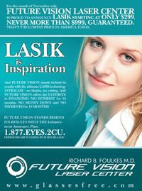


They all look kind of alike, don't they? Right down to the color scheme. I'd guess the predominant color in these ads -- blue -- springs from the fact that most people have blue or blue-green eyes. (The figure is 47%, according to the American Academy of Opthamology. The next-highest color is dark brown with 25%.) All the irises visible in these ads are certainly blue.
This leads me to wonder if LASIK ads in parts of the world where eyes are predominantly brown are different. I'll see if I can find some ads from, say, India and post them here later.
In the meantime, there is a lot more to be done with these ads. What other themes do people see?
Wednesday, July 29, 2009
LASIK
I don't think I've very found anything with quite such a direct tie to visible rhetoric. On July 9, I had LASIK eye surgery. Today, 20 days later, I can see better than 20/20. (My contact prescription previous to the surgery was in the -5.5 range.)
What does this mean for visibility for me? I can see! Anyone who has suffered through life with contacts or glasses can appreciate how entwined they become in one's life. I still reach for my glasses every morning. On occasion, when my eyes are dry, I have to remind myself not to scoot my contact around to a more comfortable position. The world is actually legible without aid. I feel naked ... and free! (Although I admit that every once in a while after a long day, I sort of miss being able to take out my contacts and let the world fade away.)
As far as the visible rhetoric surrounding LASIK, I think there is much to be analyzed. First of all, the various advertisements for LASIK are fascinating. They all seem to circle around one central point: clarity. The ads demonstrate and overtly mention that basic tenet. They also seem to gravitate toward themes of independence/strength, for obvious reasons. I may post more later on these ads and how they function.
In terms of the surgery itself, the visible rhetoric is striking. The doctor is not necessarily placed in a privileged position. Rather, she is very much part of a team; every member of that team is necessary. She is seated behind the patient, while other members of the surgical team are standing and seem to be busier than she is. My mother had LASIK a week after I did, and during her surgery the doctor encountered problems with a suction device. One of her assistants insisted firmly that the device was not attached and surgery could not be performed, and her opinion was respected. Although it is difficult for me to analyze the visible aspects of the surgery itself (given that my eyes were occupied), I can imagine the interaction of the staff and how it was visibly efficient and equal.
For those who are curious, I will also include a brief description of the LASIK procedure.
*****
The doctor will have you lie down on a surgical table in a sterile surgical suite (which, in my case, was very cold). An inflatable pillow ensures that you won't move your head too much. There are two machines in the suite, and the table is capable of rotating between them. The doctor first places a suction device on your right eyeball. This really isn't a big deal for contact users; it just feels like putting a contact in combined with a pressure sensation. Close your eye and press on your cl0sed eyelid; that's the extent of it. Then the doctor will place you under one of the machines, which attaches to the suction device (add a little more pressure here) and cuts a flap in your eyeball. (This is using the intralase method, not a blade.) You may feel a slight burning sensation, but no pain. The doctor then disengages you from the machine and suction device and you can close your eye. So far, about 22 seconds have gone by. Next, the doctor will put an eyelid clamp in place to keep you from blinking. (I was extremely worried about this, but it was no big deal. When you need to blink, you just go ahead and try. You obviously can't, but your brain thinks you did and it's taken care of. No pain or even discomfort.) Then you have the actual LASIK treatment. For me it was about 40 seconds; my mom needed more than 60. Again, a slight burning sensation is the worst of it. Then the eyelid clamp is removed. The whole process is repeated for the other eye.
The worst part is about 30 minutes later when the numbing eyedrops wear off. Your eyes will burn a bit, which makes them tear up, which makes them burn more. This lasted about 2 hours for me. After that, it was just a matter of remembering not to rub my eyes until they healed. I could see pretty clearly when I got up from the surgical table, by the way, and was better than 20/20 by the following morning.
Ah, technology and visibility. What an interesting time we live in. :)
What does this mean for visibility for me? I can see! Anyone who has suffered through life with contacts or glasses can appreciate how entwined they become in one's life. I still reach for my glasses every morning. On occasion, when my eyes are dry, I have to remind myself not to scoot my contact around to a more comfortable position. The world is actually legible without aid. I feel naked ... and free! (Although I admit that every once in a while after a long day, I sort of miss being able to take out my contacts and let the world fade away.)
As far as the visible rhetoric surrounding LASIK, I think there is much to be analyzed. First of all, the various advertisements for LASIK are fascinating. They all seem to circle around one central point: clarity. The ads demonstrate and overtly mention that basic tenet. They also seem to gravitate toward themes of independence/strength, for obvious reasons. I may post more later on these ads and how they function.
In terms of the surgery itself, the visible rhetoric is striking. The doctor is not necessarily placed in a privileged position. Rather, she is very much part of a team; every member of that team is necessary. She is seated behind the patient, while other members of the surgical team are standing and seem to be busier than she is. My mother had LASIK a week after I did, and during her surgery the doctor encountered problems with a suction device. One of her assistants insisted firmly that the device was not attached and surgery could not be performed, and her opinion was respected. Although it is difficult for me to analyze the visible aspects of the surgery itself (given that my eyes were occupied), I can imagine the interaction of the staff and how it was visibly efficient and equal.
For those who are curious, I will also include a brief description of the LASIK procedure.
*****
The doctor will have you lie down on a surgical table in a sterile surgical suite (which, in my case, was very cold). An inflatable pillow ensures that you won't move your head too much. There are two machines in the suite, and the table is capable of rotating between them. The doctor first places a suction device on your right eyeball. This really isn't a big deal for contact users; it just feels like putting a contact in combined with a pressure sensation. Close your eye and press on your cl0sed eyelid; that's the extent of it. Then the doctor will place you under one of the machines, which attaches to the suction device (add a little more pressure here) and cuts a flap in your eyeball. (This is using the intralase method, not a blade.) You may feel a slight burning sensation, but no pain. The doctor then disengages you from the machine and suction device and you can close your eye. So far, about 22 seconds have gone by. Next, the doctor will put an eyelid clamp in place to keep you from blinking. (I was extremely worried about this, but it was no big deal. When you need to blink, you just go ahead and try. You obviously can't, but your brain thinks you did and it's taken care of. No pain or even discomfort.) Then you have the actual LASIK treatment. For me it was about 40 seconds; my mom needed more than 60. Again, a slight burning sensation is the worst of it. Then the eyelid clamp is removed. The whole process is repeated for the other eye.
The worst part is about 30 minutes later when the numbing eyedrops wear off. Your eyes will burn a bit, which makes them tear up, which makes them burn more. This lasted about 2 hours for me. After that, it was just a matter of remembering not to rub my eyes until they healed. I could see pretty clearly when I got up from the surgical table, by the way, and was better than 20/20 by the following morning.
Ah, technology and visibility. What an interesting time we live in. :)
Wednesday, June 24, 2009
Welcome back?
I'm more than a little embarrassed that it's been so long since I've posted anything. I got caught up in my last semester of master's studies. On the bright side, that means I have new and interesting visual rhetoric news to report. I finished a portfolio rather than a thesis to earn my master's, which means I was able to utilize visibility in a way that would not have been possible otherwise. I'm so impressed with ISU for allowing this option. The portfolio, which is online, can be found here. Check it out! I'm continuing to research in the areas it highlights and so am always interested in constructive feedback.
Sunday, November 30, 2008
Coming down the home stretch ...
Work on my portfolio proposal is going very slowly, so I've been concentrating on a related paper for another class. I decided to apply to present that paper at the New Directions Conference next year, so I worked up an abstract to submit. I'm really hoping that having that abstract in hand will provide a little inspiration for my other projects! The abstract is as follows:
The experience of pregnancy has changed in modern times, and one of the biggest changes is the advent of fetal ultrasound. Expectant parents look forward to the ultrasound as confirmation of a pregnancy and a chance to “meet” their child. The purpose of fetal ultrasound has undergone a massive shift; it was once used sparingly as a detector of fetal abnormality and now is most often considered a social event. Almost all modern women in the United States have at least one ultrasound scan over the course of carrying a baby – but therein lies a fundamental problem. This paper will examine the reasons women choose to have those scans, and it will further posit that popular and medical rhetoric does not adequately inform women about the potential effects of fetal ultrasound, and thus influences them to have the scans. I will analyze the situation via several different analytic approaches: the societal perception of fetal ultrasound, the messages of media targeting pregnant women, physicians’ rhetoric to pregnant patients, the patriarchal tendency to support the use of fetal ultrasound, women’s reasons for consenting to fetal ultrasound, and, finally, the ethical implications of the intersections in these areas. Those intersections may also be complicated more by the application of feminist and rhetorical theories. Although this paper is not yet complete, I expect to conclude with a number of ways in which the medical community could be more transparent and ethical in its presentation of fetal ultrasound to potential users.
The experience of pregnancy has changed in modern times, and one of the biggest changes is the advent of fetal ultrasound. Expectant parents look forward to the ultrasound as confirmation of a pregnancy and a chance to “meet” their child. The purpose of fetal ultrasound has undergone a massive shift; it was once used sparingly as a detector of fetal abnormality and now is most often considered a social event. Almost all modern women in the United States have at least one ultrasound scan over the course of carrying a baby – but therein lies a fundamental problem. This paper will examine the reasons women choose to have those scans, and it will further posit that popular and medical rhetoric does not adequately inform women about the potential effects of fetal ultrasound, and thus influences them to have the scans. I will analyze the situation via several different analytic approaches: the societal perception of fetal ultrasound, the messages of media targeting pregnant women, physicians’ rhetoric to pregnant patients, the patriarchal tendency to support the use of fetal ultrasound, women’s reasons for consenting to fetal ultrasound, and, finally, the ethical implications of the intersections in these areas. Those intersections may also be complicated more by the application of feminist and rhetorical theories. Although this paper is not yet complete, I expect to conclude with a number of ways in which the medical community could be more transparent and ethical in its presentation of fetal ultrasound to potential users.
Saturday, November 22, 2008
This text is within at least three frames ...
Framing is really all about creating context, and I enjoyed the parts in Graphic Design that pointed out how often we use those contexts every day without even realizing it. One piece of example work, in fact, was made up entirely of the frames we constantly use on computer screens (pg. 100). The text you're reading here is framed - at least - by the computer screen, the window you have pulled up with your Internet brower, and the design of this web site.
A grid, as described in Thinking with Type, is basically a network of related frames. Any sort of grid divides a given space - which is likely a frame itself - into a network of smaller frames within which a designer will then work.
I also enjoyed thinking about the different ways gridding and framing can work. In TT, Lupton discussed how typography can be a frame. "Typography is a form designed to melt away as it yields itself to content" (115). This observation goes back to the most basic principle of design: Good design is invisible. The most effective frame is one that viewers don't even notice. (Of course, this changes if the frame is actually the subject of a piece -- but, in that case, the frame is performaing an additional function besides framing that supersedes framing.) If a non-designer viewer stops to notice a frame when attention should be directed inside the frame, that's an error. (Have you ever noticed the frame on the Mona Lisa? Didn't think so.) Framing, then, is the beginning of design. It has to occur first, and the rest of the piece will flow into and around it.
A grid, as described in Thinking with Type, is basically a network of related frames. Any sort of grid divides a given space - which is likely a frame itself - into a network of smaller frames within which a designer will then work.
I also enjoyed thinking about the different ways gridding and framing can work. In TT, Lupton discussed how typography can be a frame. "Typography is a form designed to melt away as it yields itself to content" (115). This observation goes back to the most basic principle of design: Good design is invisible. The most effective frame is one that viewers don't even notice. (Of course, this changes if the frame is actually the subject of a piece -- but, in that case, the frame is performaing an additional function besides framing that supersedes framing.) If a non-designer viewer stops to notice a frame when attention should be directed inside the frame, that's an error. (Have you ever noticed the frame on the Mona Lisa? Didn't think so.) Framing, then, is the beginning of design. It has to occur first, and the rest of the piece will flow into and around it.
Monday, November 17, 2008
Choices I can't choose
I'm really struggling with my final project for this class. (For anyone reading who's not in the know, I'm writing a proposal for my master's portfolio.) I've always suffered from a general lack of direction in terms of career. I never wanted to pick an undergraduate major, and I still stutter around quite a bit when people ask me what I'm going to do with my master's degree. So, my main dilemma is that I don't know how much to focus my portfolio. My two major interest areas are medical and visual rhetoric. The biggest paper in my portfolio will be on the visual rhetoric of ultrasound -- a neat combination of the two. (Chapter 8 of Practices of Looking is tailor-made to be a source for that paper.)
Thus far, I've spent time thinking about the final format of the portfolio as well as what I want its ultimate purpose to be (aside from getting that master's degree). I hope to use my portfolio -- which will take shape as a web site -- for the very practical purpose of getting a job I will love. I also want it to be something I can add to so that I can chronicle my academic work in the event that I start work toward a doctoral degree in the future. With the format and purpose decided upon, the content is making me draw a big blank. Right now, I'm thinking I'll create sections within the portfolio -- maybe something like "Visible Rhetoric," "Medical Rhetoric," "Journalism," and "Other Professional Writing Projects." I also think I'd like to include a section about my teaching experience, minimal though it is. Something like this might be ideal.
Suggestions, anyone?
Thus far, I've spent time thinking about the final format of the portfolio as well as what I want its ultimate purpose to be (aside from getting that master's degree). I hope to use my portfolio -- which will take shape as a web site -- for the very practical purpose of getting a job I will love. I also want it to be something I can add to so that I can chronicle my academic work in the event that I start work toward a doctoral degree in the future. With the format and purpose decided upon, the content is making me draw a big blank. Right now, I'm thinking I'll create sections within the portfolio -- maybe something like "Visible Rhetoric," "Medical Rhetoric," "Journalism," and "Other Professional Writing Projects." I also think I'd like to include a section about my teaching experience, minimal though it is. Something like this might be ideal.
Suggestions, anyone?
Sunday, November 16, 2008
Globalization and freedom
In my opinion, Chapter 9 in Practices of Looking encompassed way too much materials. There's so much to talk about, and just not enough time to do it in the space of a single chapter.
I'd first like to address the interaction of the terms the authors first introduce: globalization, convergence, and synergy. These concepts are often looked at with either unabashed zeal or fearful hesitance. Professionals in the media industry are particularly conflicted about this scenario. It means we can reach more consumers, but it will eliminate media jobs. This will decrease diversity, thus silencing some voices. Of course, the beauty of the Internet is that anyone can be a publisher -- but the truth of the matter is that one must have some sort of brand identification in this day and age in order to command an audience. Mere access is no longer enough.
I was also intrigued by the discussion of First vs. Third world conceptions and uses of media. (And I found the original meaning of Third World particularly interesting -- I never knew it meant anything beyond "impoverished.") The idea of television being more powerful than a military force -- which it certainly is -- was frightening. I also never knew that an international convention had established airwaves as belonging to respective countries. I find this increasing rhetoric of ownership disturbing, although I can also see why it is necessary.
Finally, my pet topic for this chapter: pornography. Sturken and Cartwright devote just a few pages to the issue of pornography, but I think it is vitally interesting. For all intents and purposes, pornography represents the most visible Internet-based battlefield out there. Feminist critics like the late Andrea Dworkin assert that pornography subjugates women, period, and that we must therefor wage war on pornography -- and free access to the Internet, by extension. Other feminists argue just the opposite -- that pornography is integral to women's liberation. I take my direction on the Internet censorship argument from a couple of landmark Supreme Court cases dealing with the dissemination of pornography (and those decisions are largely based on the First Amendment). Basically, we cannot censor material intended for the eyes of consenting adults. (Children add a new facet to the debate, but one case establishes parenting as the appropriate venue for censorship of Internet porn to children.) I think forthcoming court rulings on online pornography will likely illuminate the path all Internet content will eventually have to follow. This will have a profound affect on all the globalization and convergence currently occurring.
Wednesday, November 12, 2008
A Return to Basics
The thing I most like about graphic design - besides the fact that it's just cool - is that it's really all about mastery of the basics.
Lupton and Phillips seem to note this even with the title of their text: "Graphic Design: The New Basics." The sections on hierarchy, layers, transparency, modularity, grids and patterns confirm this. I have dealt extensively with all these elements in my short career - and I am by no means an expert designer. Yet my boss, a designer with 40+ years experience, bases his work on the same principles. (The one that most comes to mind is the grid. He uses a grid format, with story packages in modules, every day - but he can do things within that grid I can't - and, yet, the finished product is always immediately identifiable as our particular newspaper. So, I can really see how the grid can "encourage the designer to vary the scale and placement of elements without relying wholly on arbitrary or whimsical judgments" (175).)
While all the principles mentioned above are important, hierarchy stands out to me as the most important. Hierarchy goes far beyond the aesthetic, and often the consumer of a designer's material may not realize the designer has chosen what the reader's eye will see and when. Thus, hierarchy imbues design work with a serious sense of responsibility. (That's not to say those other elements don't; it's just that they all are subservient to where they are placed in the hierarchy of a piece.)
Take, for example, rollover ads. Blogger Stephen Baker notes in this entry that such ads can be pretty unethical. He's right; these are the ads that expand into the space where you just clicked, and suddenly you're heading to a site you never wanted to see and downloading cookies you never wanted contact with. This morning, I visited the Peoria Journal Star's Web site and was confronted with one of these rollover ads. (It's already been removed or I'd post a link. The paper's site is pjstar.com.) While I understand that the rollover ad might be effective, the Web page designer at least has a responsibility to not let such an ad take up residence right on the front page, at the top, where most people will certainly be clicking on the headlines listed in the space the ad will expand into. (In this particular case, the designer's ethical duty may include working with an ad representative or even the advertising client to find an alternative solution.)
Sunday, November 9, 2008
Client-based work
Ah, it's been a while since I've worked for a real client.
Our projects this week had an entirely new spin than anything else we had so far done. Knowing that an actual potential client would evaluate our work and perhaps choose to expose it to thousands of people provides a little more incentive to create a clear, compelling message. The greatest challenge in such a situation is often to produce a piece of communication that is both compelling and also agreeable to the client.
There have been times in the past when I have run into situations where what was clearly a better choice ran counter to something a client wanted. It is at this point that visual rhetoricians have to decide who they're actually serving: Are they interested in getting paid, or doing it right? When does doing it right really matter -- is it moral, or just about pride? And how do you strike a balance?
In one case, I convinced a client (a humane society) to use more pictures of animals. The society wanted to project a very professional look and so didn't want to include photos of animals -- but this was central to their mission. We compromised and came up with a document that was both cuddly and sophisticated.
In another case, working on a brochure for an engineering firm, I received explicit instructions on what to include in the document. In this case, the audience was specialized and I, as a layperson, could do little more than take direction and employ my design skills to best effect.
My point, I suppose, is that it's vital to communicate with clients. You may be able to create a better product if you can loosen their limitations. Or, they might teach you a thing or two. In rare cases, it might turn out that the client's prescriptions are unpalatable enough that the partnership can't work out -- echoing Rock's worries. His essay, although pretty abstract and vaguely reminiscent of something out of a superhero movie ("Peter, with great power comes great responsibility") does strike a chord. In order to work in the field of visible rhetoric, one will also have to be able to work with people.
Our projects this week had an entirely new spin than anything else we had so far done. Knowing that an actual potential client would evaluate our work and perhaps choose to expose it to thousands of people provides a little more incentive to create a clear, compelling message. The greatest challenge in such a situation is often to produce a piece of communication that is both compelling and also agreeable to the client.
There have been times in the past when I have run into situations where what was clearly a better choice ran counter to something a client wanted. It is at this point that visual rhetoricians have to decide who they're actually serving: Are they interested in getting paid, or doing it right? When does doing it right really matter -- is it moral, or just about pride? And how do you strike a balance?
In one case, I convinced a client (a humane society) to use more pictures of animals. The society wanted to project a very professional look and so didn't want to include photos of animals -- but this was central to their mission. We compromised and came up with a document that was both cuddly and sophisticated.
In another case, working on a brochure for an engineering firm, I received explicit instructions on what to include in the document. In this case, the audience was specialized and I, as a layperson, could do little more than take direction and employ my design skills to best effect.
My point, I suppose, is that it's vital to communicate with clients. You may be able to create a better product if you can loosen their limitations. Or, they might teach you a thing or two. In rare cases, it might turn out that the client's prescriptions are unpalatable enough that the partnership can't work out -- echoing Rock's worries. His essay, although pretty abstract and vaguely reminiscent of something out of a superhero movie ("Peter, with great power comes great responsibility") does strike a chord. In order to work in the field of visible rhetoric, one will also have to be able to work with people.
Wednesday, November 5, 2008
Information Communications Professional Technical Document Design

This week's design readings were informative for me in a number of ways. They made me feel a little schizophrenic - as talk of design often does - because I wanted to engage them in about six different ways at once. (As Schriver notes, design is in everything from the newspaper to the height of your high heels.) While the principles of design are constant (as is the knowledge that sometimes breaking with principles is the best course), they can be applied in very different ways depending on context.
I was most struck in Schriver's piece by the acknowledgment and foregrounding of the fact that design does not happen as the last step in a document (at least, not in an effective one). We recently developed a set of templates at the newspaper where I work. Although these templates were intended to be for use during elections (they provide visual rhetorical strategies for comparison using all the CRAP principles), they could be applied to a lot of other things with the aid of a competent designer -- and reporter. These templates are examples of design coming before textual content is even a thought. I might send a reporter out to get me a photo of each of several candidates and the answers to certain questions in order to complete the document I have designed to flow with that particular content. (See the example above -- the reporter had to know and understand this design before beginning work on textual elements.)
Context was also a major facet of Markel's analysis, particularly in the final section that focused on critique. For example, one image was from a company magazine and a question accompanying it asked if there was a enough white space. For a magazine, the answer was no. For a newspaper, the white space allotment was acceptable. That point, for me, is the most important. All the CRAP principles, accessing tools, resource limitations and audience engagemtn techniques aside, a good designer always, always has to be aware of context.
That said, I think context is also the answer to Schriver's naming quandary. What I call "document design," whenever I do it, depends on who I'm doing it for. When I volunteered to design a magazine for a fifth-grade class, I called it "magazine design." When I work at the newspaper, it's "page layout." When I'm working on a project for school, I tell people I'm doing "technical communication." And when I'm talking to a fellow technical communicator, I generally say "professional communication" -- because, to me, that seems to be the most apt term for what I do.
But then again, I am my own context. It'll be different for everyone.
Subscribe to:
Posts (Atom)


